Our New Branding Explained
If you are nutty about branding like us then you will have seen that we have updated our whole brand, including new fonts, colours and of course amazing new logo.
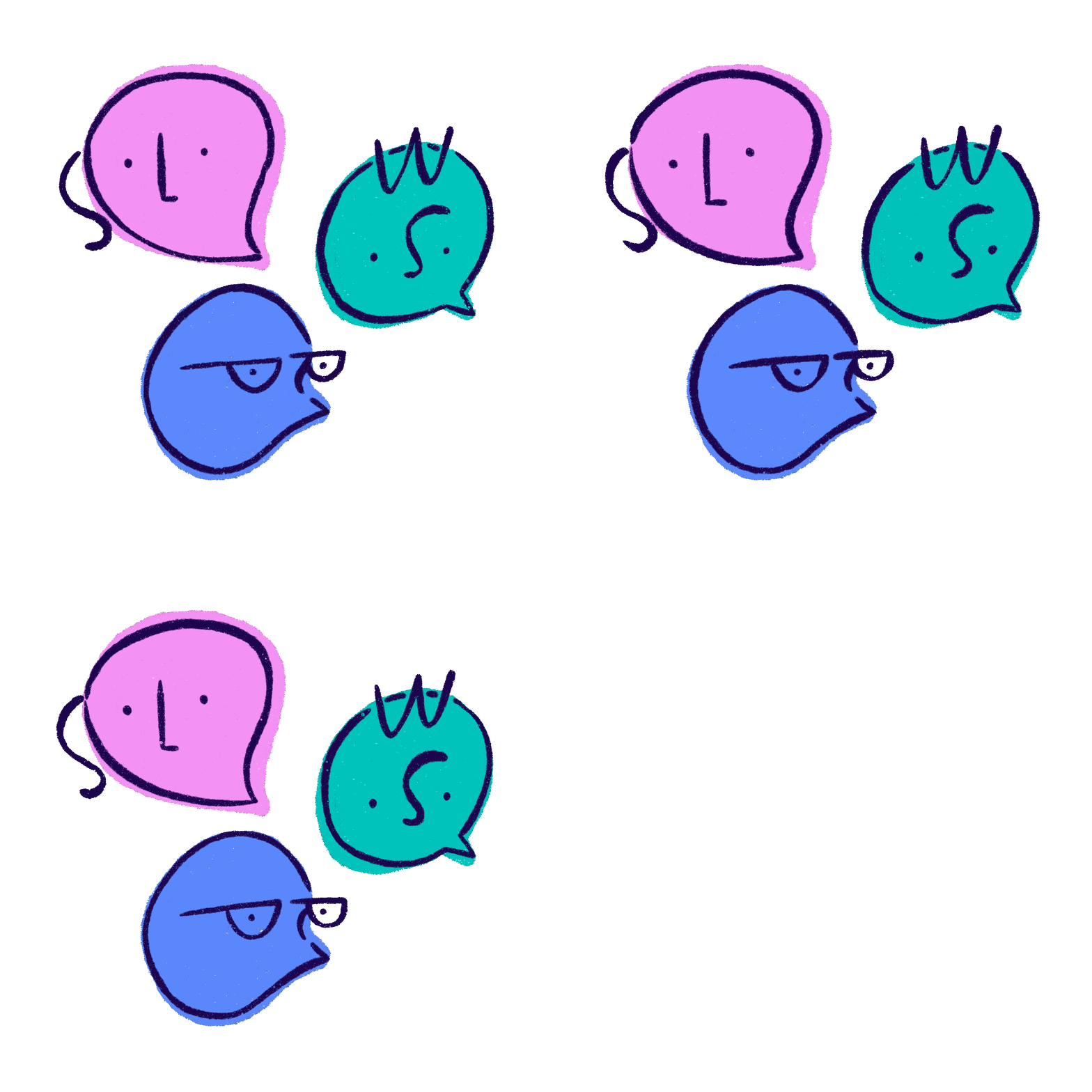
We wanted something bright, fun and that captured the English and Welsh side of our organisation. We worked with Julia Bethan on the whole branding exercise. Julia listened to what we had in our heads then worked her magic, we have to say that we really feel that Julia captured SPW perfectly. We love that the speech bubbles are people and that all of their features spell out SPW and LRS. It was really great going through this whole process and getting this refresh of the brand which is more fitting to who we are as we move forward.
Julia explains all about the branding process:
This summer after doing some illustration work for Single Parents Wellbeing, I was chuffed to be asked by the team to take on their visual rebrand. From the first branding questionnaire, I knew they were after something playful, simple, modern & casual. It was important for SPW that their empowering and positive approach came across clearly, and for this the colours needed to be bright and not muted – this was utterly fine by me and I got to work testing out various colours. The colours selected were inspired by the cool tones in Monet’s water lilies paintings, from which I drew out the brightest blues, greens and pinks (I’ve now become obsessed with the colour blue after this!).
Concepts for the logo were centred around communication and network and needed to include both Welsh and English text. Logos always take the longest time, as they should because they encompass the identity of an organisation. After going through a few options the combination of speech bubbles (communication) and heads (network) was ideal, but it needed something to make it unique to SPW. That’s when it clicked to make the facial features the letters SPW (Single Parents Wellbeing) and LRS (Lleisant Rhieni Sengl). This logo was a puzzle but it was so satisfying to combine all these elements. Feedback from the SPW team was essential for this, a true collaborative effort. The illustration and banners styles all played off the logo, using simple line work and bold colour blocks to create playful and dynamic visuals. The illustrations convey a variety of all of the things SPW organise, from activities, training, challenges, fundraising to name a few!
I had such a glorious time working with SPW on their rebranding and I’m really privileged to have been asked to take this on. Big thanks to the dreamboats behind such an important network and resource for human beings big & small (& illustrators too!).


